By Denise Callan, Momentum
When it comes to launching a new project, first impressions count. One of the first tasks of a project consortium is to establish a clear visual identity, one that represents the objectives of the project and can also create impact, particularly with our target audiences.
With an in-house design team and over 20 years of brand development, marketing and communications experience in the food, beverage and education sectors, Momentum is the co-lead of dissemination in DIGIFABS. We are responsible for creating the branding, including the logo and branded templates for presentations and publications. We also led the sourcing of images that represented the project, its activities, and ambitions, and set the tone of voice of the brand.
Creating a logo
A well-designed logo with strong imagery can make a brand more memorable and recognisable to its audience. Importantly, it also helps to convey the brand’s personality and identify the project’s aim with our target groups.
The process began with a Momentum team brainstorming session with lead graphic designer Gillian and webmaster Ivan with the wider project team Denise, Paula and Orla. Several concepts were explored, and finally, a short list of brand ideas was developed and presented to all the partners. The options were put to an online vote, and the final logo was selected by a wide margin. Refining our tagline was a very important step also – how to distil a project into a handful of words. This is always an interesting phase of the project and helps partners understand their motivations – we speak about project values and what our target groups need and will resonate with.

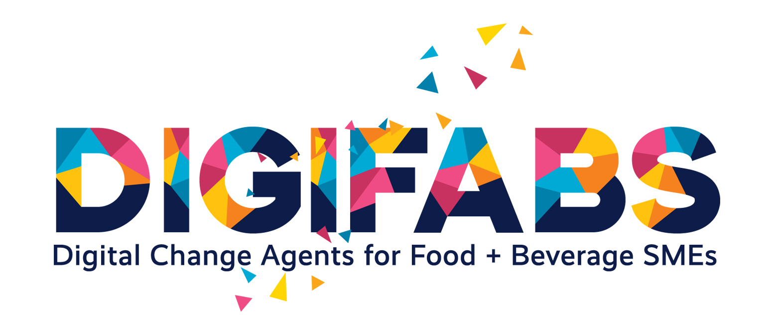
The logo concept for the DIGIFABS brand embodies the essence of digital resilience and innovation in the food and beverage (F&B) industry. Using geometric triangular shapes in motion, the design symbolises the F&B community and its dynamism. Triangles are often used to mark cycles of growth. This aligns with the DIGIFABS Project as we aim to equip, empower and guide SMEs on a pathway of growth and resilience. Let’s share some of the logo’s key features:
- Fonts are a very powerful way of communicating. Design is how you look; type is how you sound. A font-only logo design was selected to strategically target the people we want to impact with the project. The main typeface used in the DIGIFABS logo is a customised font specifically designed for the brand, giving it a unique and distinctive look. The tagline, on the other hand, utilises the “Realist Medium” typeface, known for its modern and clean design that complements the customised font in the logo. This combination creates a cohesive and visually appealing brand identity for DIGIFABS.
- Colour – The logo identity is enhanced by the vibrant and energetic colours of dark navy, pink, sky blues, orange, and yellow. This distinctive colour palette will help maintain global consistency across our website, social media channels, publications, presentations, and event materials.
- Let’s bring in movement – we knew the brand stood out as a single image, but we were keen to include an animated format that creates a dynamic visual story that engages viewers and conveys our brand’s energy, innovation and focus on digitisation. Many thanks to Vedran of Outside Media for his fantastic work.
Project images
A picture paints a thousand words. Images are a crucial element of every brand story. It is very important that the images we use visually represent the brand’s values, identity, and message. We have created a library of approved images available to all consortium partners to use, and this library will continue to grow with the project.
The brand in action
The branding has made its debut on our website, social media channels, and presentations given by partners. In time, we will see the branding also used in the development and delivery of training materials and as we host in-person events. Watch this space.
